Gratitude Seafood
Nuu Chah Nulth Seafood approached Hot Tomali to create a new premium aboriginal themed seafood brand, assess target markets, and identify profitable products. The brand needed to be true to it’s roots, the Nuu Chah Nulth culture, whilst differentiating itself from other brands on the shelf that use aboriginal graphics.
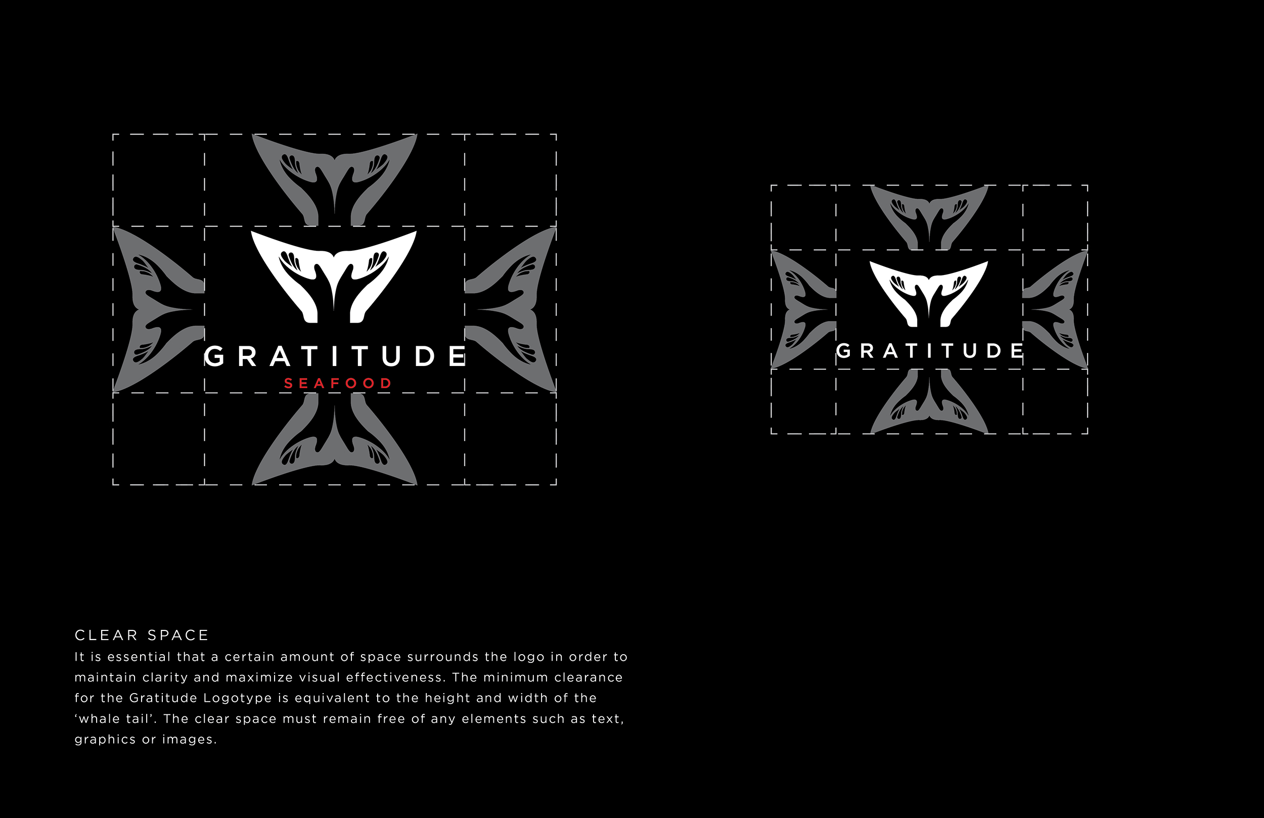
After performing in depth market research, and meeting with key stakeholders, Hot Tomali developed a brand story which resonated with the culture of West Coast Aboriginals. This influenced the naming exercise, resulting in Gratitude Seafood. The logo takes its inspiration from the welcoming monument in Port Alberni, where the brand is based, the out turned hands signifying gratitude and emphasising a whale tail.


Brand Guidelines
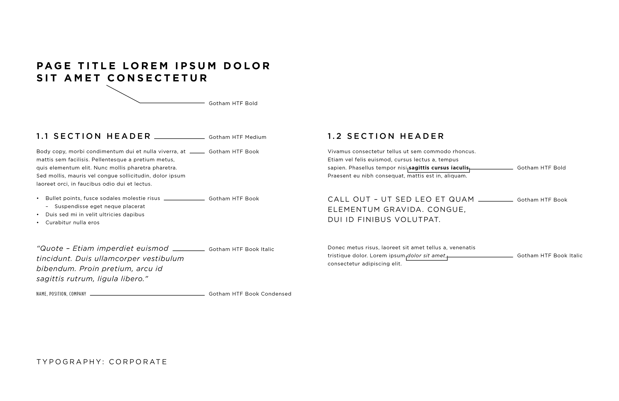
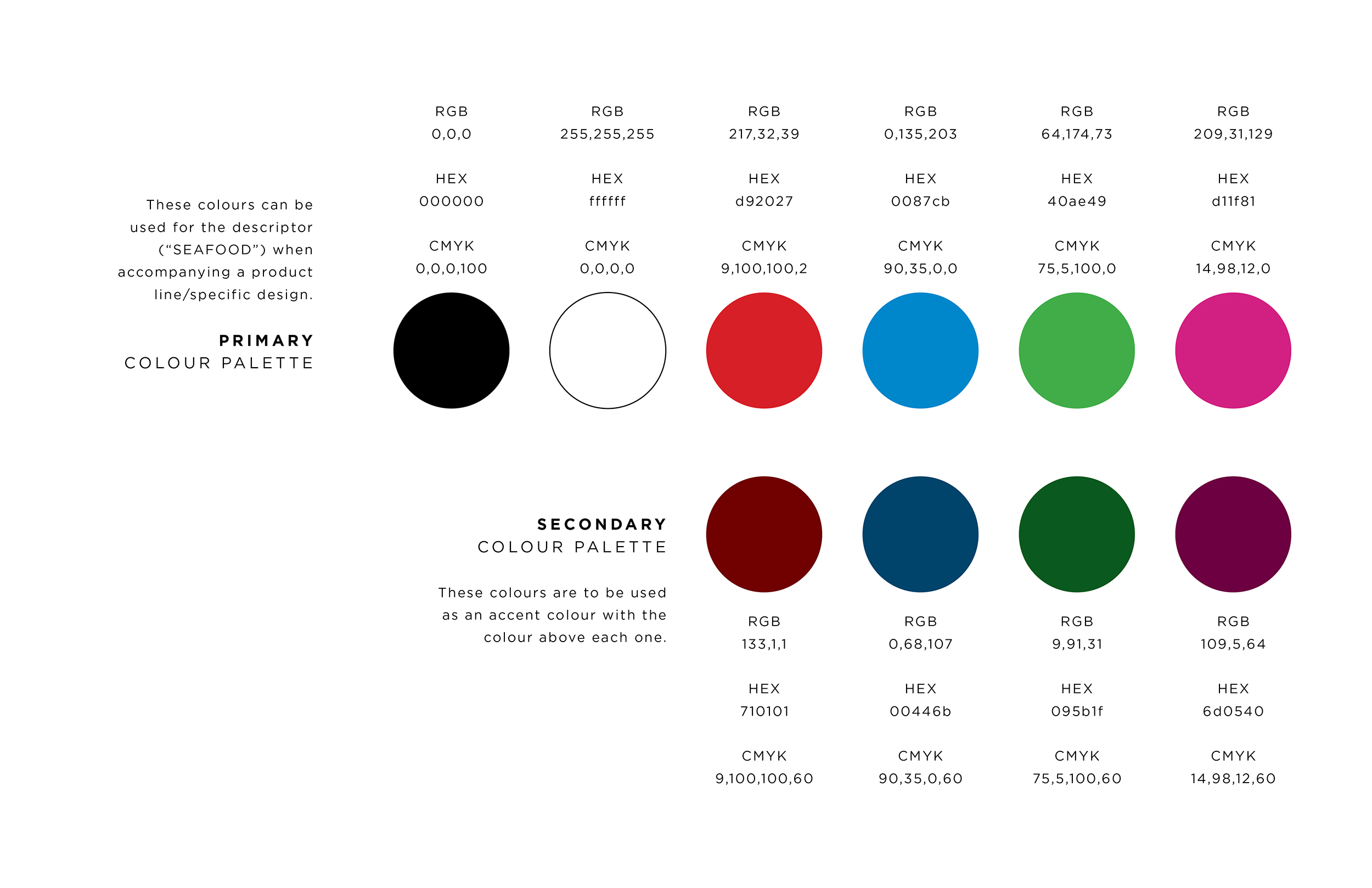
In depth brand guidelines were created to ensure the brand has synergy in it's early days, ensuring it embodies the premium look, feel, and tone desired.


Packaging
Colours predominantly found in Nuu Chah Nulth art were used to accent black backgrounds and white text to create a premium feel. From the art researched, graphical elements presented themselves to bring the designs back to it's West Coast Aboriginal roots, namely the frame which lists the fish variety within it.

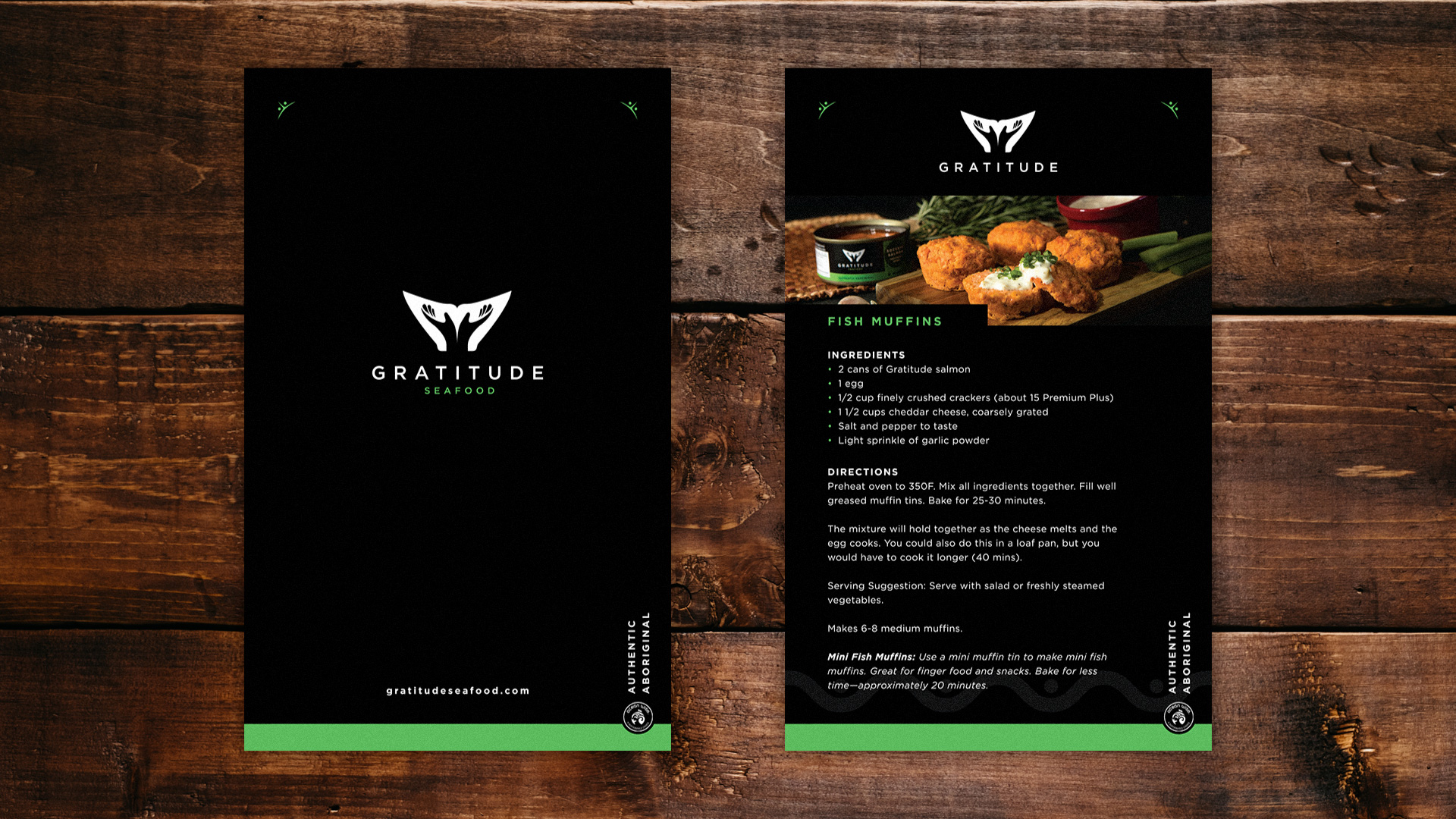
Hot Tomali went on to incorporate the brand vision into some preliminary marketing materials such as a brand brochure, and recipe cards.


Circle of Life
The brand now has a solid base to expand from, with a brand story steeped in cultural tradition to lead communications.
